
Getting your Shopify theme just right can be a breeze, and there’s no need for any complicated coding skills. It’s all about giving your website personalization that reflects your unique style.
Whether you’re just starting out or have dabbled a bit, grasping those theme settings can truly enhance your experience.
The fantastic news? There are loads of userfriendly templates available to make this process smooth and fun.
You’ll pick up on how to adjust colors, fonts, and layouts effortlessly.
So, let’s dive right into making your online store setup feel like your personal canvas, inviting and tailored to your vision through stunning ecommerce design, seamless website personalization, adjustable theme settings, and user-friendly templates that reflect your unique brand identity.
| Step | Description | Tools/Options | Tips for Non-Coders |
|---|---|---|---|
| 1. Choose a Suitable Theme | Pick a theme matching your brand and product style | Shopify Theme Store, free & paid themes | Preview demos, read reviews, check mobile-friendliness |
| 2. Use Shopify Theme Editor | Customize layout, colors, fonts, and content without coding | Shopify’s built-in Theme Editor | Use drag-and-drop sections; experiment with color palettes |
| 3. Add and Customize Sections | Add homepage sections like slideshow, featured products | Theme Editor Sections | Rearrange sections by dragging; hide unused sections |
| 4. Upload Logo & Brand Assets | Upload your logo and images to personalize your store | Shopify Admin > Theme Editor > Settings | Use high-quality images with transparent backgrounds |
| 5. Customize Navigation Menus | Create and organize menus for easy site navigation | Shopify Admin > Online Store > Navigation | Keep menus simple; group similar items |
| 6. Edit Fonts and Colors | Adjust typography and color scheme to fit brand identity | Theme Editor > Typography & Colors | Stick to 2-3 fonts and a consistent color palette |
| 7. Add Products | Enter product details, images, prices, and variants | Shopify Admin > Products | Write clear titles & descriptions; use high-res images |
| 8. Set Up Payment & Shipping | Configure payment gateways and shipping options | Shopify Settings | Enable popular payment methods; set realistic shipping rates |
| 9. Install Apps for Extra Features | Add apps for reviews, marketing, or SEO without coding | Shopify App Store | Choose apps with good reviews; avoid too many to keep speed |
| 10. Preview and Test Store | Check site on desktop and mobile before publishing | Shopify Preview Mode | Test navigation, checkout, and load times |
| 11. Publish Your Store | Launch your customized Shopify store | Shopify Admin > Online Store > Publish | Announce launch on social media and email lists |
Understanding Theme Settings For Non-coders

Getting your website just right can seem like a tall order, but it’s all about making the right adjustments. With a bit of insight into theme adjustments, you can transform your online presence to perfectly align with your brand.
Many contemporary themes come equipped with visual editing tools that simplify layout customization, meaning you don’t need to be a coding whiz to create a stunning site.
From changing colors and fonts to rearranging content blocks using a straightforward drag-and-drop interface, you’ll have everything you need at your fingertips.
This level of responsive design ensures your site will look sharp on all devices, which is key for engaging your audience effectively.
If we dive deeper into the components involved, it’s clear that options and flexibility take center stage. Custom visual editing tools, a drag-and-drop interface, responsive design, layout customization, and CSS adjustments make the website user-friendly and adaptable to various needs.
How To Select Userfriendly Templates
Choosing the right template can feel just like finding a comfy chair that fits your personal style. When searching for options that cater to nontechnical users, it’s important to think about how they match your store branding.
Ensure that the choices reflect your unique aesthetic and vibe.
A key aspect to watch for is a design that’s responsive, meaning it should look sharp on any device, whether it’s a smartphone or a desktop.
Also, consider how much customization is possible; templates should allow for HTML tweaks that don’t demand extensive technical know-how. This flexibility opens up opportunities for color palette selection and font management, ensuring your store feels distinctly like yours.
Shifting from the look to the functionality, let’s explore how HTML tweaks can empower nontechnical users to enhance store branding through effective color palette selection and font management.
.
Template Selection for Nontechnical Users
- Responsive design ensures optimal viewing across all devices, enhancing user experience.
- Customization options allow nontechnical users to make changes without needing extensive coding skills.
- Effective color palette selection can significantly impact brand recognition and customer engagement.
- Font management enables stores to maintain a consistent brand voice and aesthetic.
Customizing Layout For Your Online Store
Creating an impactful online presence goes beyond simply picking a design; it’s about crafting an experience that reflects your brand. Start by considering your design aesthetics.
What kind of atmosphere do you want your customers to feel when they visit your site? Carefully evaluate your product display options to ensure your items captivate attention.
Utilizing high-quality image uploads can make a world of difference in showcasing your offerings.
Plus, don’t overlook mobile optimization—having a responsive layout is key to enhancing the customer experience across devices.
Transitioning from choosing user-friendly templates to customizing your layout can feel seamless when you focus on these elements. As you dive deeper, visual editing tools can make it easy to adjust and tweak your design, ensuring every detail aligns with your vision, including image uploads, product display options, mobile optimization, design aesthetics, and customer experience enhancement.
Visual Editing Tools For Easy Adjustments
Transforming your online store doesn’t have to feel like a complex puzzle. The right tools can streamline the process and help you create a visually appealing site effortlessly.
- Intuitive Drag-and-Drop Interfaces:With a simple drag-and-drop user interface design, changing your layout becomes a breeze. Just grab an element and move it where you want it. Popular platforms like Shopify and Wix have perfected this feature, making them top choices for many creators. It’s all about making those quick adjustments without diving into coding alternatives.
Ready-made templates are like having a head start in the race of setting up your SEOfriendly themes, conversion rate optimization, coding alternatives, theme marketplaces, and user interface design.
Online Store Transformation
- Intuitive drag-and-drop interfaces reduce the time needed to set up an online store.
- Platforms like Shopify and Wix are widely used due to their user-friendly design features.
- Ready-made templates can significantly enhance SEO and conversion rates.
- Using coding alternatives can be avoided, making website customization accessible to non-technical users.
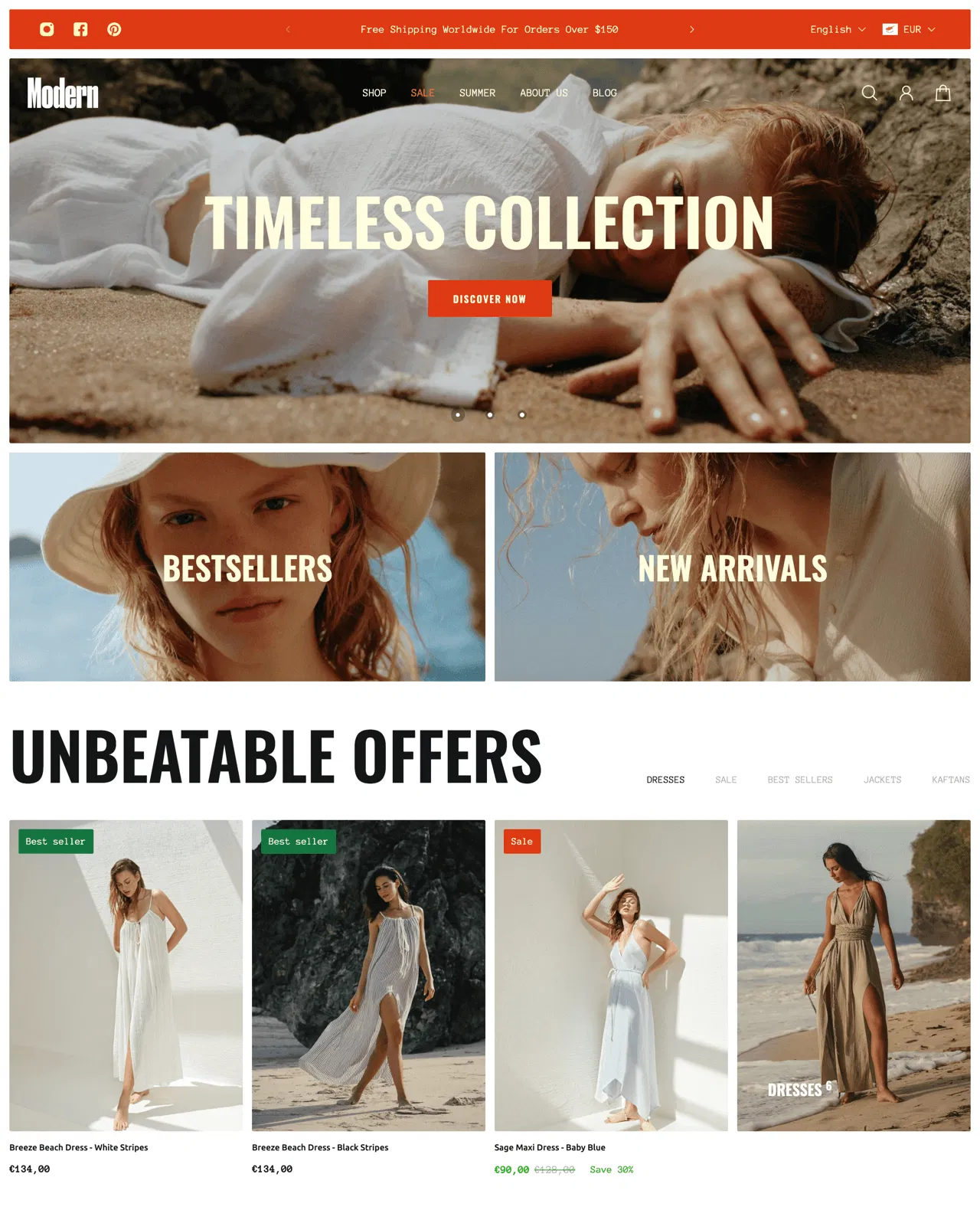
Enhancing Store Branding With Design Aesthetics

Creating a strong visual elements impression is crucial for engaging shoppers and establishing a memorable identity. Design aesthetics significantly contribute to the connection between the customer and the store experience.
Incorporating strong visual elements can evoke emotions and tell your brand’s story beautifully.
For instance, warm colors can inspire comfort, while bold shades might energize shoppers and create excitement.
Typography matters as well; selecting fonts that resonate with your brand voice enhances credibility and readability. Investing in high-quality imagery is paramount—this can draw customers in and keep them engaged.
Together, these components weave a cohesive look that elevates your store’s identity, making each visit memorable.
Transitioning from effective visual editing tools to tips for effective color palette selection can be seamlessly accomplished by focusing on how color influences perception. Color choices are an essential part of graphic design principles, as they significantly influence visual elements, plugin integration, retail enhancements, and overall theme support resources.
Tips For Effective Color Palette Selection

Picking the perfect hues can truly transform your brand’s personality. The magic of color lies in its ability to evoke feelings—imagine blue instilling trust or red sparking excitement.
As you dive into this process, consider how these shades reflect your brand’s identity and message.
Utilizing tools like Adobe Color can streamline your search for the right combo that supports your online branding strategies.
Plus, think about how your choices can impact navigation improvement, enhancing the overall user experience. Testing your color selections through A/B methods is a smart move, inviting valuable user feedback to fine-tune your palette.
Accessibility comes into play here, too.
Make sure your choices are inclusive and easy on the eyes. A seasonal refresh of your colors can keep your store feeling lively and in tune with current trends. A thoughtfully crafted UX design can significantly enhance navigation improvement and checkout customization while aligning with effective online branding strategies and comprehensive theme documentation.
| Color Impact | User Experience |
|---|---|
| Blue evokes trust | Improved navigation |
| Red sparks excitement | Enhanced checkout customization |
| Inclusive color choices | Seasonal color refresh |
Image Uploads: Best Practices For Merchandising
To truly captivate your audience, the quality of your visuals plays a pivotal role. High-resolution images not only boost the appeal of your products but also encourage potential buyers to engage.
Studies reveal that about 67% of consumers see image quality as a significant factor when making online purchases.
If your visuals are blurry or pixelated, you might be slipping sales to competitors who prioritize eye-catching imagery.
When selecting image formats, think about what works best for your visual merchandising approach.
JPEGs are fantastic for photographs thanks to their balance of quality and compression. PNGs shine when transparency is needed, while GIFs can add a playful touch but are limited in colors.
It’s all about choosing the right file type for your store layout and the message you want to convey.
This approach not only enhances accessibility features and design consistency but also optimizes template selection, visual merchandising, and store layout for an improved shopping experience.
Responsive Design: Why It Matters For Sales
Ever tried to browse an online store from your smartphone only to encounter a jumbled mess?. The right setup allows your site to adjust effortlessly to any screen size, enhancing brand identity.
When visitors can easily find their way around your site, they’re likely to linger longer and explore more products.
But wait, there’s more—this type of design also ramps up user engagement.
Studies indicate that a staggering 70% of mobile users will ditch a site that doesn’t cater to their device.
This kind of abandonment can take a serious toll on sales funnel optimization. When you simplify the experience for users, they become more inclined to make a purchase.

By understanding brand identity, implementing sales funnel optimization, analyzing theme performance, integrating analytics, and applying color theory, businesses can significantly enhance their marketing strategies.
Mobile User Experience
- 70% of mobile users abandon sites that are not optimized for their devices.
- Improved mobile design can lead to longer visitor engagement and exploration of products.
- A seamless browsing experience enhances brand identity and encourages purchases.
- Integrating analytics helps businesses understand user behavior and optimize sales funnels.
Conclusion
Customizing your approach can make a significant difference in the success of your online store. Focusing on elements like typography choices not only enhances the overall look of your brand but also boosts readability, making it easier for visitors to engage.
An engaging product showcase is key; it should capture attention while remaining easy to navigate.
Simple tweaks can lead to impressive site speed optimization, ultimately providing a more enjoyable shopping experience.
Looking back at our previous discussion on responsive design, it’s clear that when you prioritize these aspects, you’re more likely to turn casual shoppers into loyal fans. Keeping your digital storefront dynamic and tailored to the preferences of your audience will yield the best results.
Here’s to your continued success in customization, from your typography choices to your digital storefront, product showcase, site speed optimization, and ecommerce functionalities.
Originally posted 2025-02-10 06:41:35.