

Choosing the perfect theme for your WordPress site is more about your audience than aesthetics. With an increasing number of users accessing the web through their phones, ensuring mobile compatibility has never been more important.
A responsive design is key to providing a user experience that keeps visitors coming back.
When users pull up your site on their mobile devices, they expect fast loading times and layouts that adjust seamlessly to their screens.
As you dive into the array of WordPress templates, remember to prioritize a theme that looks great and performs well across all devices. Focusing on mobile optimization will truly enhance how effectively you connect with your audience.
| Criteria | Description | Why It Matters for Mobile | Tips to Check |
|---|---|---|---|
| Mobile Responsiveness | Theme adapts layout smoothly on different screen sizes | Ensures content is readable and navigable on phones | Use Google Mobile-Friendly Test or browser resizing |
| Fast Loading Speed | Theme loads quickly on mobile networks | Improves user experience and SEO rankings | Check demo site speed on mobile using tools like GTmetrix |
| Touch-Friendly Design | Buttons, menus, and links easy to tap | Prevents user frustration on small screens | Test clickable areas and menu usability on a phone |
| Clean and Simple Layout | Minimal clutter, clear typography | Enhances readability and reduces bounce rate | Look for themes with mobile-optimized typography |
| Optimized Images | Images resize and load efficiently | Saves data and speeds up load time | Check if theme supports lazy loading and adaptive images |
| Compatibility with Plugins | Works well with mobile-focused plugins (e.g., AMP) | Enhances mobile site performance and features | Review plugin compatibility in theme documentation |
| Regular Updates & Support | Theme receives ongoing updates for mobile tech changes | Keeps site secure and functional on new devices | Check theme changelog and support responsiveness |
| SEO Optimization | Built-in SEO best practices for mobile | Helps mobile users find your site easily | Look for schema markup, clean code, and fast load times |
| Customization Options | Easy to adjust mobile settings without coding | Allows tailoring mobile experience | Use live preview and theme customizer for mobile view |
| Cross-Browser Compatibility | Theme works well on all popular mobile browsers | Consistent experience across devices and browsers | Test on Chrome, Safari, Firefox mobile browsers |
Understanding Responsive Design Principles

Think about how frustrating it can be to visit a website that doesn’t fit your device. It’s all about creating a seamless experience, no matter what you’re using.
A well-crafted interface makes sure your content shines, whether someone is browsing on a smartphone or a desktop.
Responsive frameworks are key players here, offering the tools needed to make layouts adapt effortlessly to different screens.
With components like fluid grids and flexible images, your site can adjust its appearance automatically, creating an engaging environment for users. Media queries also come into play, helping CSS change to match specific device characteristics.
Performance optimization is crucial to keeping users engaged and satisfied with their interactions, ensuring they come back for more
How To Ensure Mobile Compatibility
Ensuring your website looks great across all devices is more important than ever. Choose the Right Theme: Look for customizable themes that prioritize site responsiveness.
This means your content will adapt beautifully to any screen size.
Test, Test, Test: Don’t just assume everything looks good! Use tools that check crossdevice functionality to see how your site performs.
Always keep in mind, a seamless user interface on mobile enhances your visitors’ experience. The easier it is to engage with your content, the higher your retention rate will be.
Checking these factors regularly ensures your website meets the expectations of modern users. Transitioning smoothly from understanding responsive design principles to selecting the best WordPress templates will enhance cross-device functionality through customizable themes, improve the user interface, ensure site responsiveness, and establish a strong visual hierarchy.
Website Responsiveness
- Over 50% of global web traffic comes from mobile devices, making responsiveness crucial.
- Websites that are mobile-friendly can improve conversion rates by up to 90%.
- Google prioritizes mobile-responsive websites in search rankings, impacting visibility.
- Users are 67% more likely to purchase from a mobile-friendly site.
Selecting The Best WordPress Templates

Selecting the right template for your WordPress site can really set the tone for what you want to achieve. Start by considering the main goal of your website.
Are you looking to share your thoughts through blogging, display a stunning portfolio, or kickstart an online store? Knowing your purpose can significantly streamline your choices.
After that, pay attention to the design; aim for scalable design that can adapt well to various screen sizes—this is especially important for optimizing mobile navigation.
User reviews can also be a treasure trove of information; themes with high ratings often indicate reliability. Look for SEO-friendly themes, as they help improve your site’s visibility and performance, ensuring a seamless experience for visitors.
Here are our top picks:
| Theme Name | Price | Key Features | Best For | Free Version? |
|---|---|---|---|---|
| Astra | Free / Pro $59+ | Lightweight, super fast, highly customizable, SEO-friendly | Blogs, business, portfolios | Yes |
| GeneratePress | Free / Pro $59+ | Minimalist design, fast loading, mobile-optimized | All niches, especially blogs | Yes |
| OceanWP | Free / Pro $39+ | Responsive, WooCommerce ready, highly extendable | E-commerce, business, blogs | Yes |
| Neve | Free / Pro $69+ | Mobile-first design, AMP compatible, fast | Small businesses, blogs | Yes |
| Hestia | Free / Pro $69+ | Modern material design, responsive, live customizer | Startups, agencies, portfolios | Yes |
| Zakra | Free / Pro $69+ | Lightweight, responsive, multiple starter sites | Businesses, blogs | Yes |
| Sydney | Free / Pro $69+ | Responsive, page builder friendly, translation ready | Businesses, freelancers | Yes |
| Hello Elementor | Free | Barebones theme optimized for Elementor page builder | Designers, agencies | Yes |
| Blocksy | Free / Pro $49+ | Fast, Gutenberg optimized, highly customizable | Bloggers, businesses | Yes |
| Ashe | Free / Pro $39+ | Clean blog theme, mobile optimized, SEO friendly | Personal blogs, lifestyle sites | Yes |
Enhancing User Experience On Mobile
Creating a delightful experience for those browsing on their phones can make all the difference. Mobile users thrive on smooth interactions, making it vital to prioritize their preferences.
A thoughtfully crafted site not only boosts user engagement but also invites visitors to return time and again.
With draganddrop builders readily available, designing layouts that cater to mobile needs is now more straightforward than ever.
These tools bring layout flexibility, allowing developers to tailor their designs without too much fuss. Fast loading times are equally important; studies indicate that even a one-second delay can drastically reduce user retention. So, let’s explore what truly matters in enhancing that experience, including drag-and-drop builders, layout flexibility, content management, mobile accessibility, and user engagement.
Importance Of Mobile Optimization Techniques
Connecting with users on their mobile devices is a game changer for businesses today. With more than half of web traffic coming from phones, it’s a missed opportunity if your site isn’t tailored for these screens.
Picture yourself trying to use a website that isn’t mobile-friendly; it’s like trying to fit a square peg in a round hole.
Fast loading times can keep visitors glued to your site, dramatically affecting whether they make a purchase or bounce away.
Leveraging HTML5 can elevate this experience to new heights.
Another element to consider is responsive design. This approach adjusts your site to fit any screen size, creating a seamless experience that enhances engagement.
Incorporating touch-friendly features simplifies interactions, making it effortless for users to explore. If mobile-first design isn’t on your radar, you risk missing out on valuable traffic. Implement a website that features HTML5 and CSS3, provides JavaScript support, includes retina-ready design, and offers premium themes.
Evaluating Responsive Frameworks For Themes
When it comes to building a website, finding the perfect framework can make all the difference for device compatibility. Responsive grids play a central role in how smoothly content transitions across screens, and they help create a user-friendly experience.
It’s important to choose frameworks that prioritize flexibility along with solid customer support to enhance your overall project.
Fast loading times are also a must; no one enjoys the frustration of a slow-loading site! Don’t overlook the value of thorough theme documentation either, as it can save you time and headaches during theme updates or troubleshooting.
Keeping these elements in mind will set you on the right path toward a framework that truly boosts user satisfaction.
| Key Features | Importance |
|---|---|
| Responsive Grids | Enhance content transition across devices |
| Customer Support | Provides assistance during development |
| Fast Loading Times | Improves user experience and satisfaction |
| Theme Documentation | Saves time during updates and troubleshooting |
The Role Of UI Design In Themes

Think about how the look and feel of a website can draw you in or push you away. A well-crafted interface shapes the entire user experience, making it one of the most important aspects of a theme.
When elements come together in a pleasing way, they create a welcoming space that encourages users to stay longer.
Visual hierarchy plays a significant role here; organizing information helps ensure browser compatibility and allows users to find what they need effortlessly.
For instance, content-rich platforms thrive on well-defined sections, while a sleek portfolio site benefits from a more minimal design.
Maintaining design consistency across devices is equally important.
Whether someone is on a laptop or a smartphone, a cohesive experience amplifies engagement. Colors and typography should transition smoothly, enhancing usability across different screens. Every little detail contributes to the overall success of a website, from browser compatibility and design consistency to eCommerce and social media integration, as well as meeting accessibility standards.
Assessing Performance Optimization For Mobile Sites
When it comes to engaging audiences on the go, fine-tuning how your site performs on mobile is key. With a significant uptick in mobile traffic, diving into metrics that matter can really sharpen your strategy.
For example, site speed is a major player in keeping visitors happy.
Research indicates that if a site takes longer than three seconds to load, 53% of mobile users are likely to bounce.
Focusing on image optimization and the quality of your code can make a real difference in how quickly your site responds.
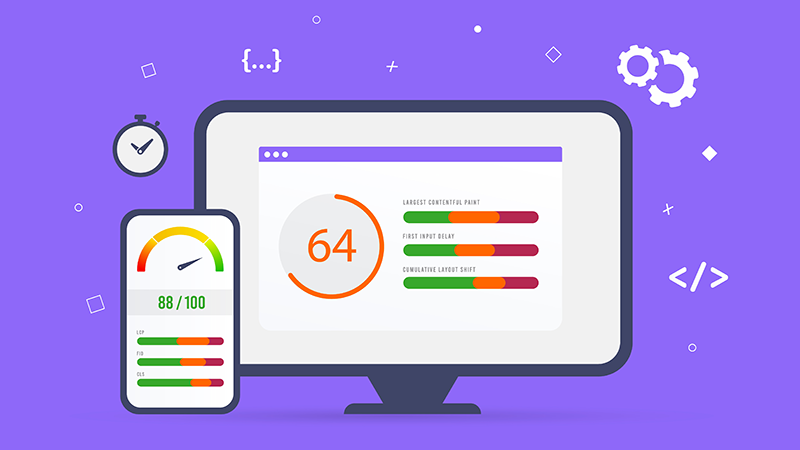
Another important element is responsive design. A well-crafted responsive WordPress theme adjusts beautifully to various screen sizes, ensuring usability isn’t sacrificed. Common missteps, such as neglecting typography settings, can hinder readability on smaller screens and detract from the overall user experience by affecting color schemes, image optimization, site speed, and code quality.
Mobile Optimization
- 53% of mobile users are likely to bounce if a site takes longer than three seconds to load.
- Image optimization can significantly improve site speed and user experience.
- A responsive design ensures usability across various screen sizes, enhancing overall user satisfaction.
- Neglecting typography settings can hinder readability and affect the overall user experience on mobile devices.
Conclusion
As we finish our discussion on optimizing mobile sites, it’s evident that selecting an ideal theme can really elevate your online presence. Prioritizing mobile responsiveness means your site will look and function beautifully across all devices.
Dive into your site analytics to gauge user engagement; those numbers can provide valuable insights into what’s working and what needs tweaking.
Exploring themes with strong security features can protect your content and visitors alike.
Plus, widgets support can enhance functionality, creating a more interactive experience for users. Keep these aspects in mind, including security features, widgets support, site analytics, theme ratings, and layout builders, and you’ll be well on your way to building a mobile site that keeps visitors coming back for more!.
Originally posted 2025-02-10 06:41:35.